Breaking Out With CSS Grid Layout
Programming - Apr 19, 2024
A while back I shared a simple technique for allowing certain elements to fill the full viewport width from within a fixed-width container:
.u-containProse {
  max-width: 40em;
  margin-left: auto;
  margin-right: auto;
}

.u-release {
  margin-left: calc(-50vw + 50%);
  margin-right: calc(-50vw + 50%);
}
Code language: CSS (css)
As concise as this technique was, it had one big, dumb caveat: On some platforms, you’d see a horizontal scrollbar unless you set overflow-x to hidden on the body element.
It’s now a year later and every modern browser supports (or will soon support) CSS Grid Layout (hooray!!). I thought it might be fun to reexamine this problem with a fancy set of modern layout tools at our disposal.
Our Goal
In my last article about Grid, I mentioned how important it was to approach layout problems with fresh eyes so you aren’t misguided by years of workarounds and CSS muscle memory. So let’s review what we hope to accomplish from a design standpoint:
- We want to limit the width of prose content to promote readability.
- But sometimes, the reader may benefit from an element being full-width. For example, a nice photograph or a detailed chart.
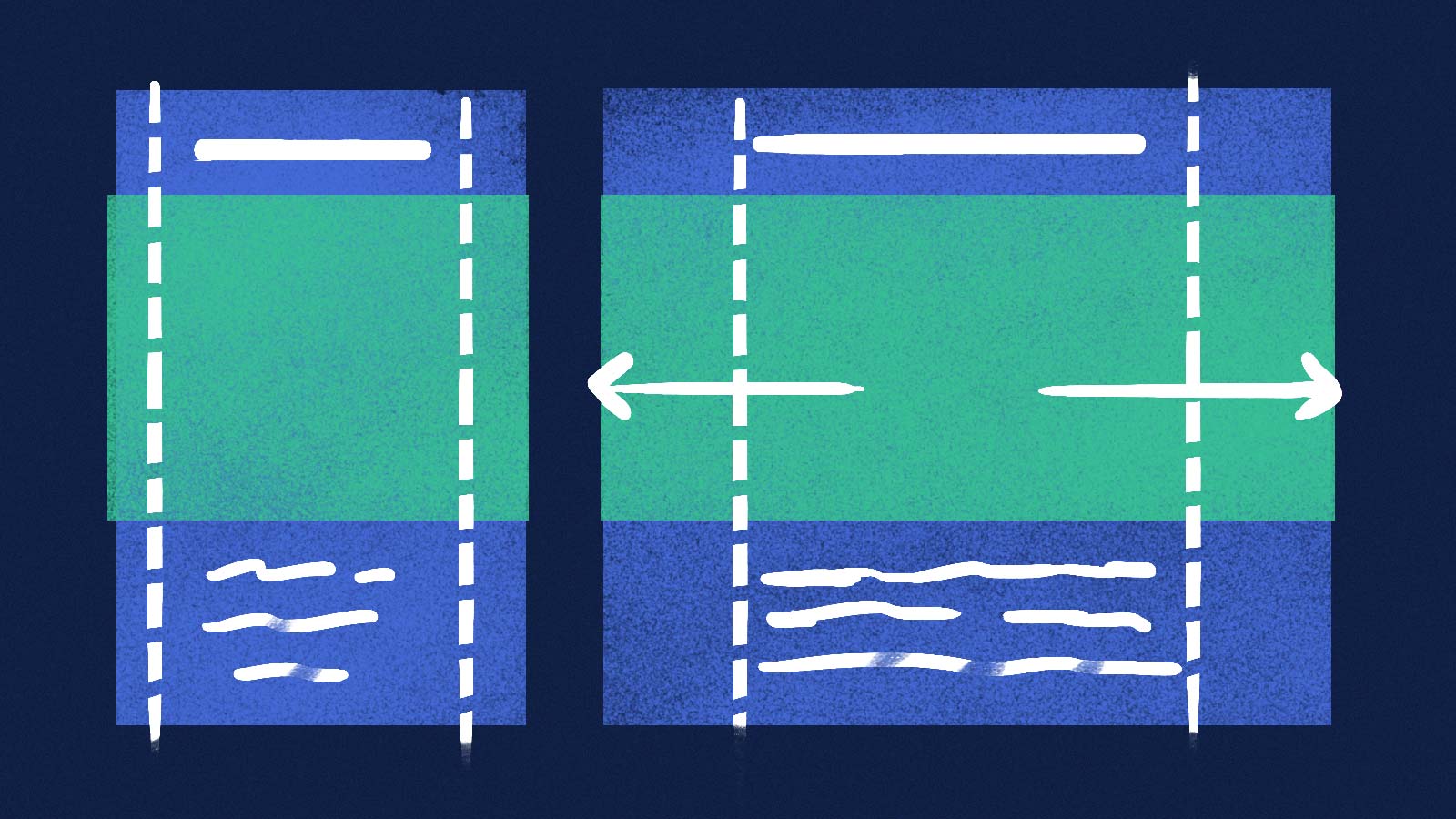
If we sketch this out, we can see that what we’re really after isn’t so much a fixed-width container with margins… it’s more of a three-column layout, with a main column flanked by two gutters. Most content will fill only the middle portion, but our super-fancy visual content will span all three.
With that in mind, it’s time to write some CSS!
Column Like You Sees ‘Em
Let’s start by styling our containing element, which will wrap the article content:
.Prose {
  display: grid;
  grid-template-columns:
    [full-start] minmax(1em, 1fr)
    [main-start] minmax(0, 40em) [main-end]
    minmax(1em, 1fr) [full-end];
}
Code language: CSS (css)
Here we’ve defined three columns. The first and last are our gutters, with a minimum size of 1em but the ability to stretch to fill one unit of available space. Between them is our main content column, which can stretch to a maximum width of 40em.

We’ve also assigned names (in brackets) to the dividing lines between columns. These are entirely optional, but they’ll make the rest of our styles easier to read, write and maintain.
Next, we instruct all child elements of Prose to neatly occupy our main column:
.Prose > * {
  grid-column: main;
}Code language: CSS (css)
And finally, we make a class for elements we’d like to span the full container width:
.Prose-splash {
grid-column: full;
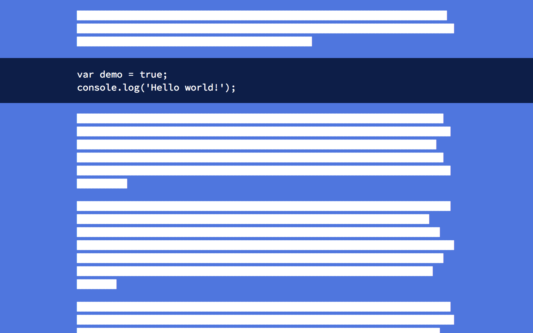
}Code language: CSS (css)And that’s it! Here’s the end result, no overflow-x or negative margins required:

But that’s not all…
Cool New Tricks
Because full-width elements are based on their container and not the viewport, this technique works great for asymmetric layouts:

This also means full-width elements may reliably align with content above and below, which provides some fun opportunities for styling special elements like block-quotes or code blocks:
We can also consider utilizing the gutter space in novel ways that previously required much more hackery:

Inevitable Downsides
While this technique has some really promising qualities, there are also some drawbacks to consider:
- You can’t
floatimmediate children of an element withdisplay: grid. - Grid is being adopted very rapidly, but it’s still not as well supported as what I shared last year.
- Many aforementioned benefits also apply to using
*:not()selectors instead.
Those caveats may be deal-breakers for many, but I predict these sorts of techniques will grow more attractive as CSS Grid Layout becomes more and more prevalent. It seems only natural for our content to extend the composition of our interfaces.
Special thanks to Erik Jung for his demo assistance and technical review of this article.
